Ethan Walker

Non-Profit Branding with Purpose
Ocean Conservancy is a nonprofit organization that works towards protecting the ocean from the greatest global challenges. As the Coronavirus pandemic has ravaged the population, missions such as theirs are struggling. Partially due to the urgency to focus on the larger issue on hand but also due to the fact that much of their fieldwork and political work that occurs in Washington, D.C. is being pushed aside. While the Coronavirus takes precedent, the global challenges that we face to protect the ocean will continue during and after. Because of this, it’s important to keep nonprofit organizations such as Ocean Conservancy running smoothly from operations to funding. I conducted research in two areas: what is currently being done and working in the ocean conservation sector, and what aspects of a nonprofit’s visual identity make it more successful. I discovered that a strong brand is often put aside to dedicate more funding towards an organization’s mission. However, in a sector that has more than doubled in the past ten years, it’s no longer a suggestion to have a strong identity. An improved identity leads to several benefits in this sector, such as increased brand recognition, a community, and increased funding. I have created a new extensive visual identity for the Ocean Conservancy, working to improve elements from the logo all the way to the imagery and voice that the brand utilizes. By redeveloping the visual identity I hope to solidify the Ocean Conservancy as a player in the nonprofit sector, allowing them to continue its mission through the current struggles that it and many other organizations are facing.
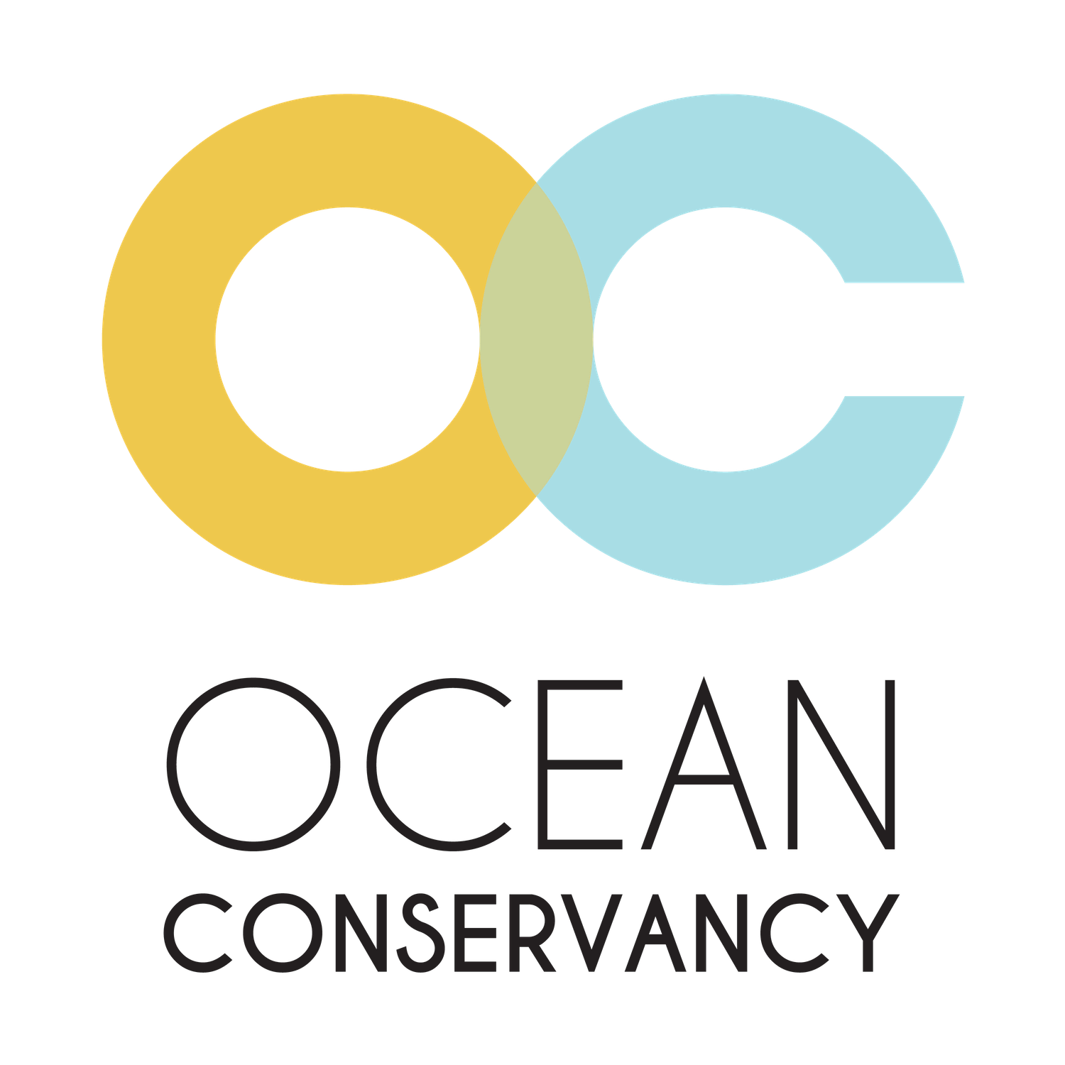
Ethan Walkers reimagined logo for Ocean Conservancy. For a more expansive look at the new visual identity go to the full project website linked at the top of this page.

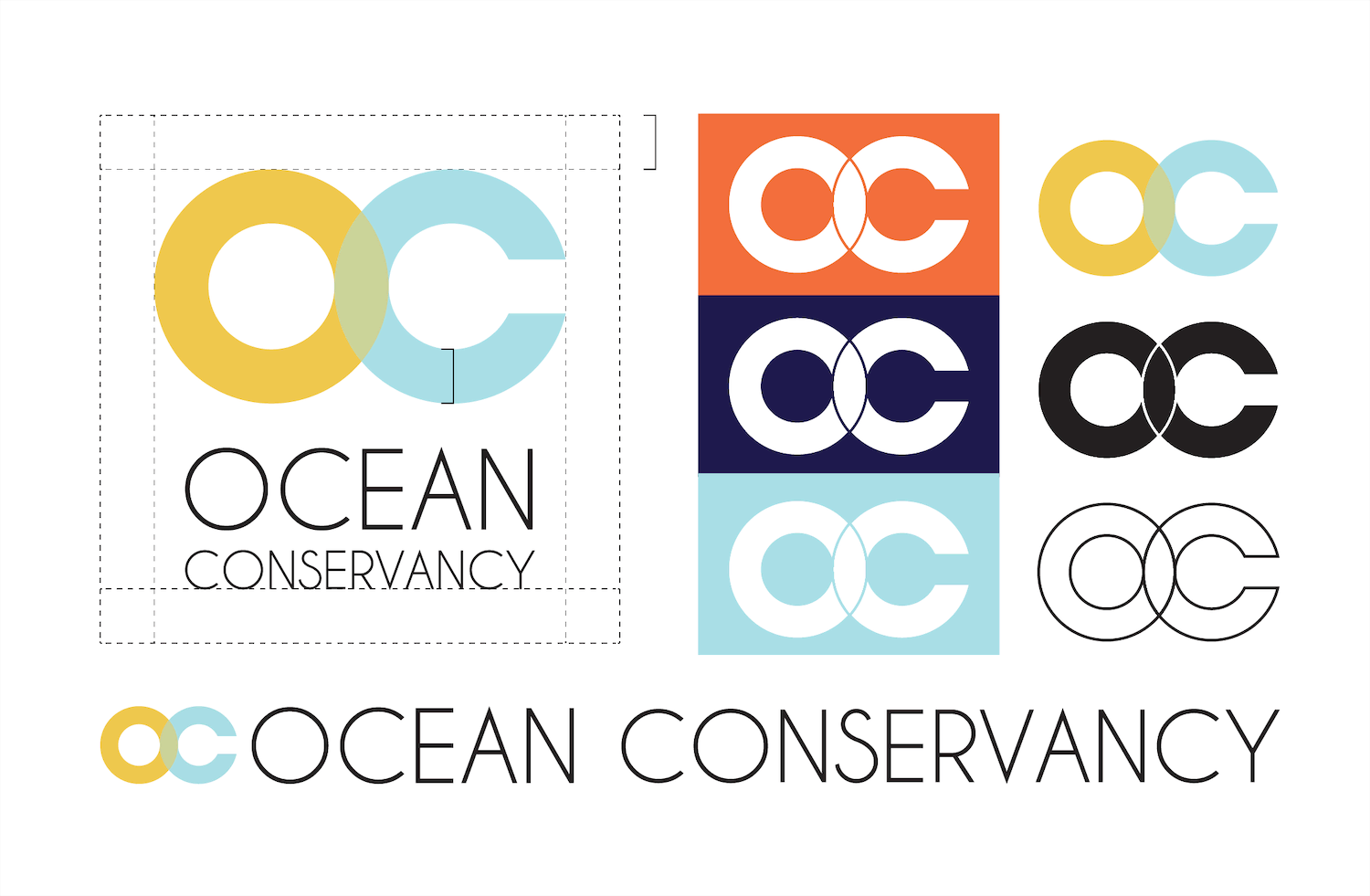
Ethan Walkers reimagined logo for Ocean Conservancy. These, among other brand elements, are displayed with more detail in the Full Visual Identity Guide as well as on the project’s full website (linked above).

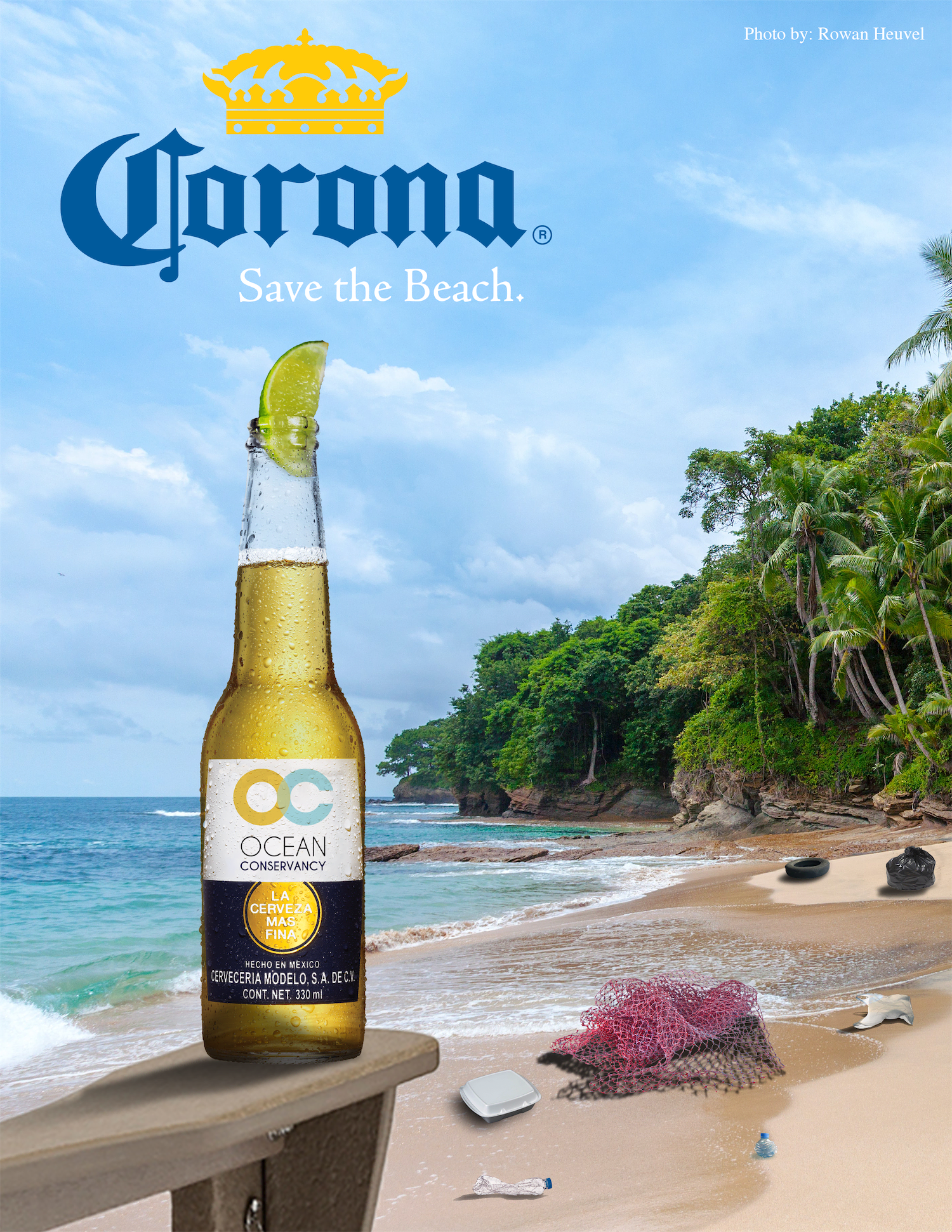
One of the new visual identities marketing/outreach directions examining the benefits of partnering with larger, more recognizable brands to further exemplify the Brands voice.

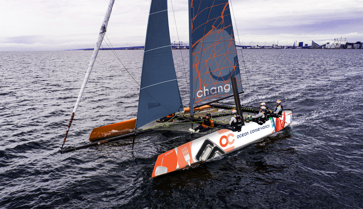
Another marketing/outreach direction utilizing sponsorship of events that are detrimental to surroundings and directly related to Ocean Conservancy’s mission. Shown here: a GC32 Racing Sailboat decorated to create the allusion that the boat is racing through a harbor full of waste.
This is the full visual identity guide for Ethan Walker’s re-imagination of Ocean Conservancy Non-Profit Visual Identity.
