Emily Considine
Identicons
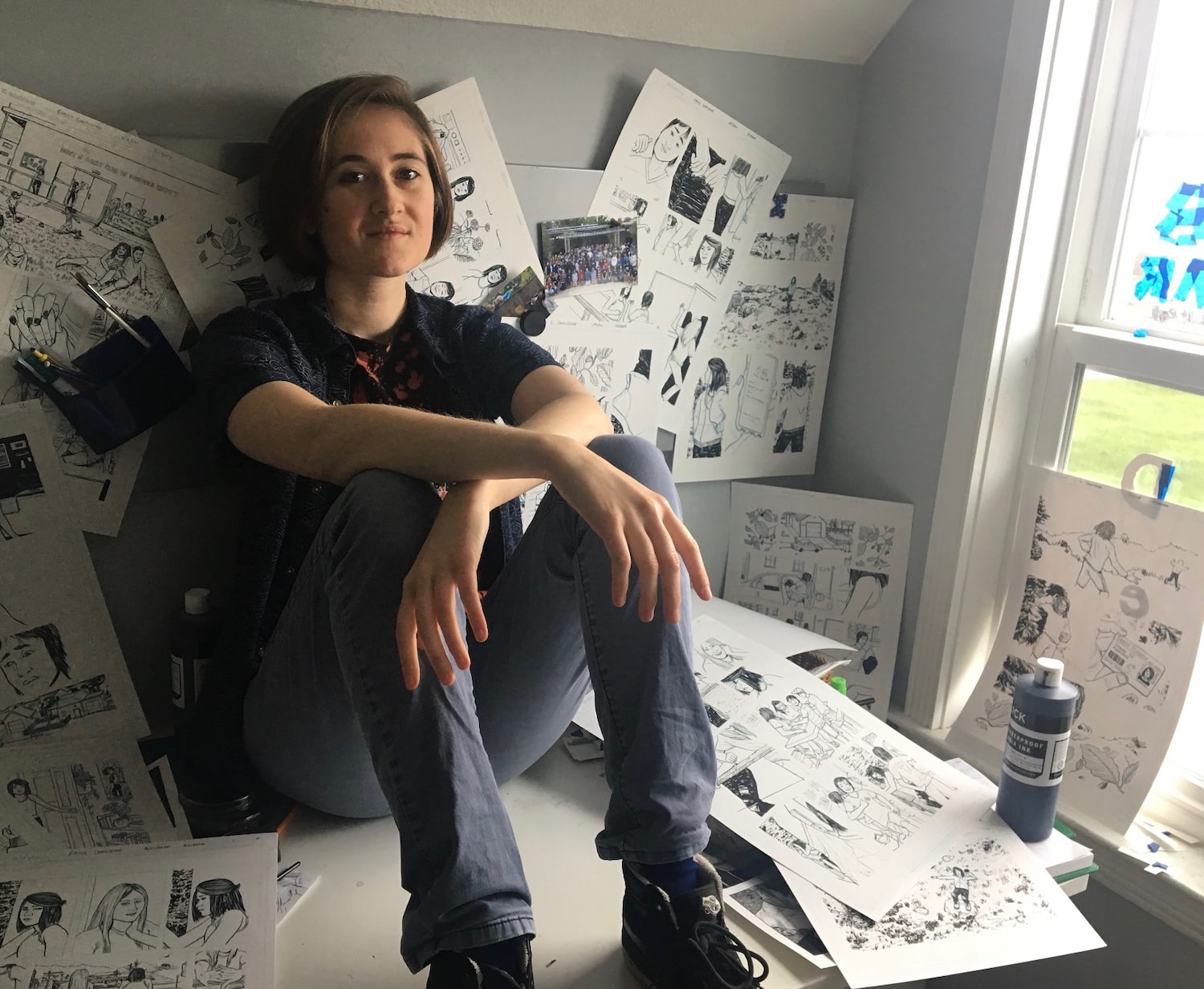
I am an illustrator interested in how social and environmental interaction, particularly online, shape personal identities. In the past, I have illustrated for [arts, ink], The Michigan Daily, and the U-M Museum of Art. Between fall 2020 and early 2021, I interviewed eighteen young LGBTQ+ women in North America about their joys and frustrations with identity on social media. Some participants appreciated online spaces' ability to dispel loneliness. Others found online behavioral trends harmful and suffocating. What does it mean for a group with varying levels of confidence and self-understanding to be tasked with projecting themselves online? What happens when we are continuously learning from, performing for and perceiving each other as models of ‘queerness’ and womanhood through algorithmic interfaces? In exchange for each interviewee’s participation, I created six icon-like illustrations meant to represent some part of their identity or online experience without showing their face. The resulting project, Identicons, takes unique information – in this case, interviews – and returns custom images, creating an intentionally diluted outsider’s perception of the individual and their experiences. This process mirrors that of real-life identicons, which are unique default profile images for users on social media who have not chosen their own.The Identicons print book format — 4.5 inches square, about 1/4 of an inch thick.
Click here to download this PDF file
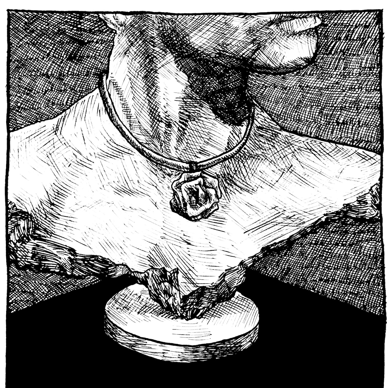
One of the project’s 120 illustrations, this image for interview #2 was a chance to explore feelings of literally putting one likeness on a pedestal while connecting it back to something personal and handmade (the necklace).
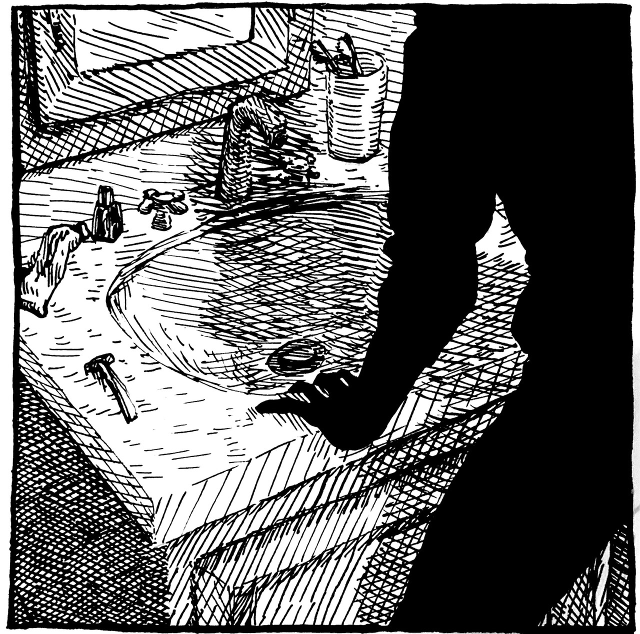
One of the illustrations for interview #11. To preserve anonymity, I did not show any faces — meaning some creative solutions and heavy use of silhouettes for more figure-based compositions.
One of the common themes explored in this project is that of obscuration/revelation, often represented through filtered layering that fuzzes, hides, reveals, or otherwise alters the image behind it in some way, like in this illustration for interview #12.
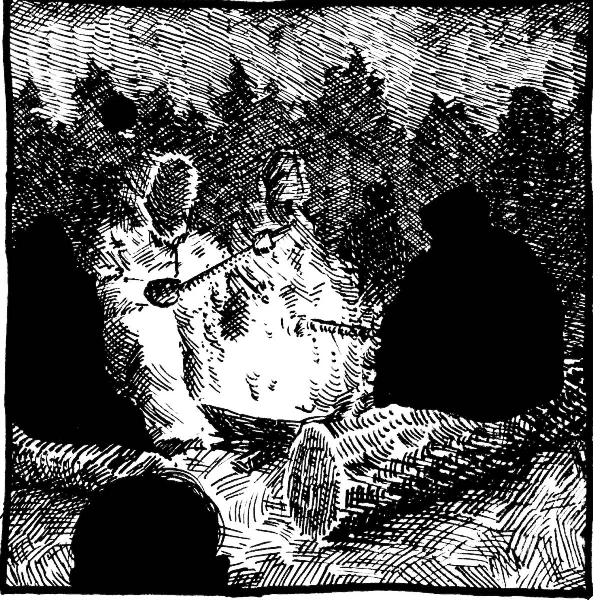
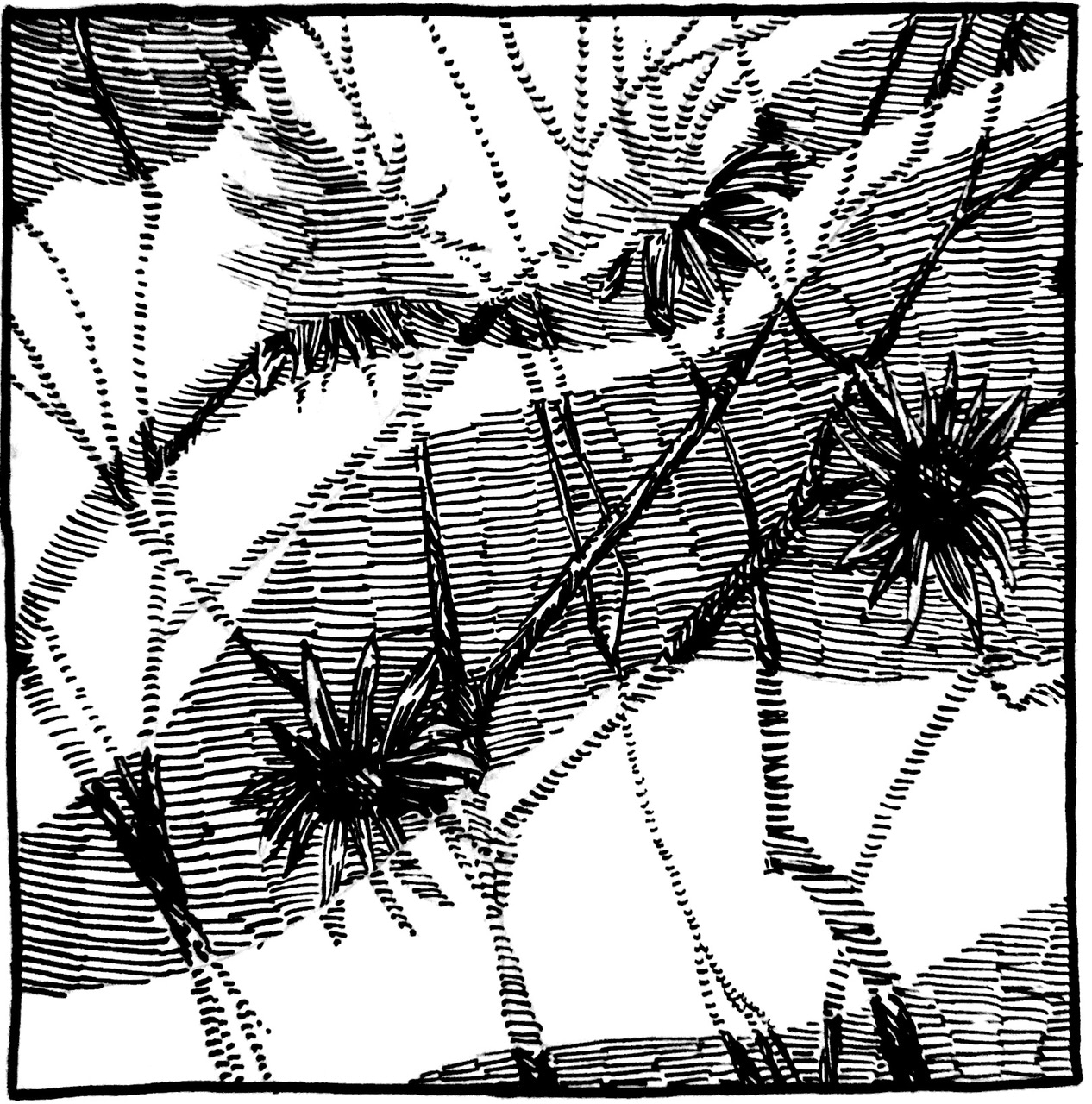
One of my goals for this project was generative work — making a large quantity of artwork in order to see what unexpectedly appeared — which is why I made six illustrations per person. While some of the results were less interesting to me, some turned out more successful than expected, like this campfire light for interview #4.
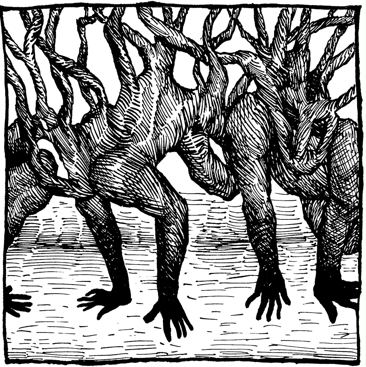
A common visual theme was intertwining branches of vaguely humanoid shape, like seen in this illustration for interview #18. It’s a visual pattern I’ve been playing with for a while, exploring how to represent the positives of social connection as well as its more negative possibilities of confusion or obstruction.
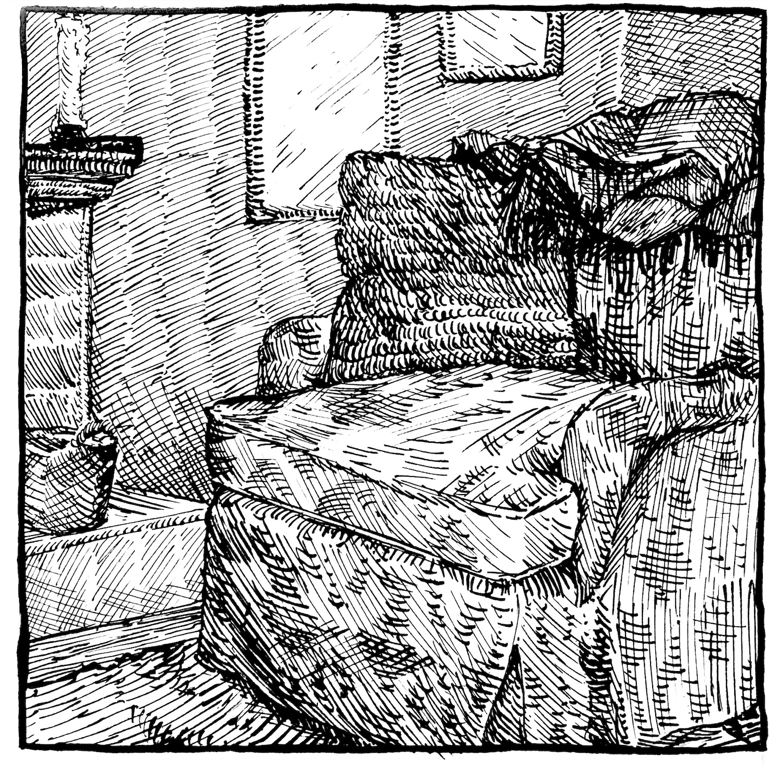
Another theme that varied between participants was amount of comfort or discomfort/mistrust each felt — toward themselves, toward their peers, and toward other LGBTQ+ individuals on social media. I usually used symbolic objects or environments, like the chair here for interview #9, to represent these feelings.